Start with the house, not the lights
The most common mistake in choosing a color scheme is to pick the color first and ask the house to cope. Your exterior already has colors: the brick or stone, the roof, the trim and the front door. A scheme that works with them looks designed. One that fights them looks applied.
Look at the house in daylight and note the dominant tones. Warm materials such as red brick, tan stone and wood suggest warm whites and reds. Cool materials such as gray stucco, painted white siding and metal roofs suggest crisp whites and blues. Let that guide the first decision.
Warm white: the classic
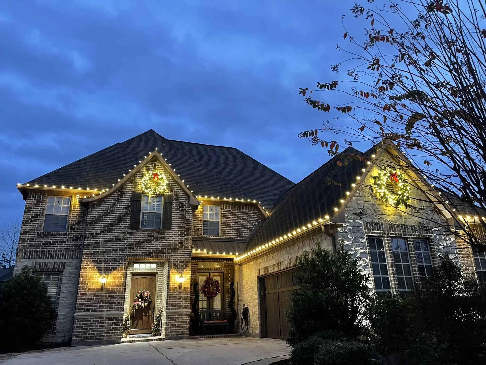
Warm white is the most popular choice, and for good reason. It suits nearly every exterior, it looks elegant in photographs and it ages well, since it never feels tied to a trend. A warm white display on a brick or stone home has a glow that feels like a fireplace seen from the street.
It is also the easiest to combine with other things. Wreaths, garland, ground lighting and tree wraps all look right in warm white, and if you decide to add color later it can sit alongside the white you already have. Our guide to warm versus bright white explains how to pick the right shade.
Multicolor: nostalgic and joyful
A multicolor roofline is the look many of us remember from childhood, and it is having a revival. It reads playful and family-friendly, and it can look wonderful on a ranch or a cottage-style home. The trick is restraint elsewhere: if the roofline is multicolor, keep the trees and ground lighting white or a single color.
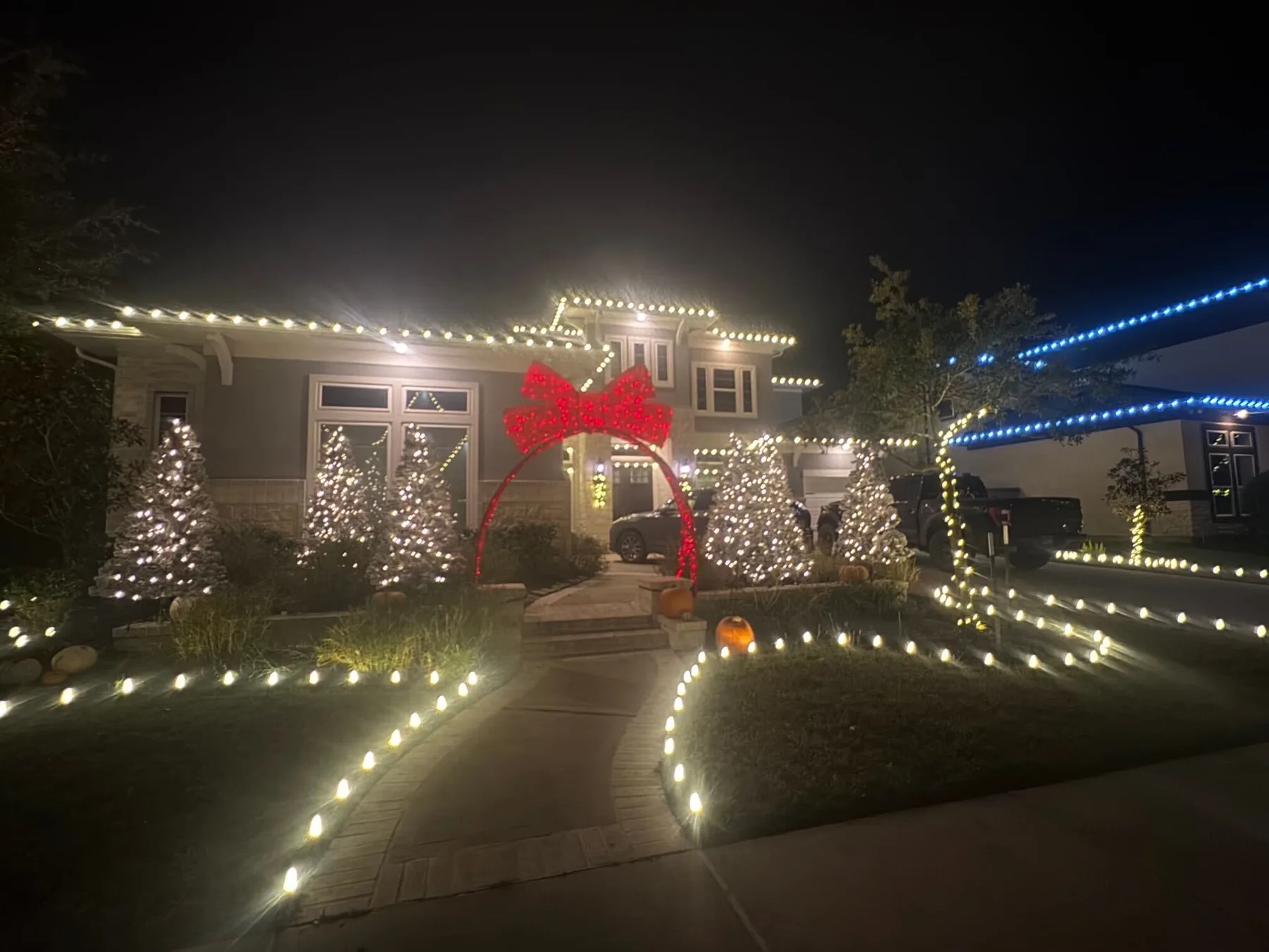
Multicolor works best with larger bulbs, because smaller ones can look busy at a distance. You can see the effect in our gallery, where a multicolor roofline on a two-story home and a multicolor ranch with a wreath each show how the color holds together when the line is clean.
Red and green, and red and white
Red and green is the traditional Christmas pairing, and it suits brick homes especially well, since red brick and red lights harmonize. Use green sparingly, as an accent on a few elements, so it does not turn muddy at night. A red and green line along the gables with white on the trees is a reliable combination.
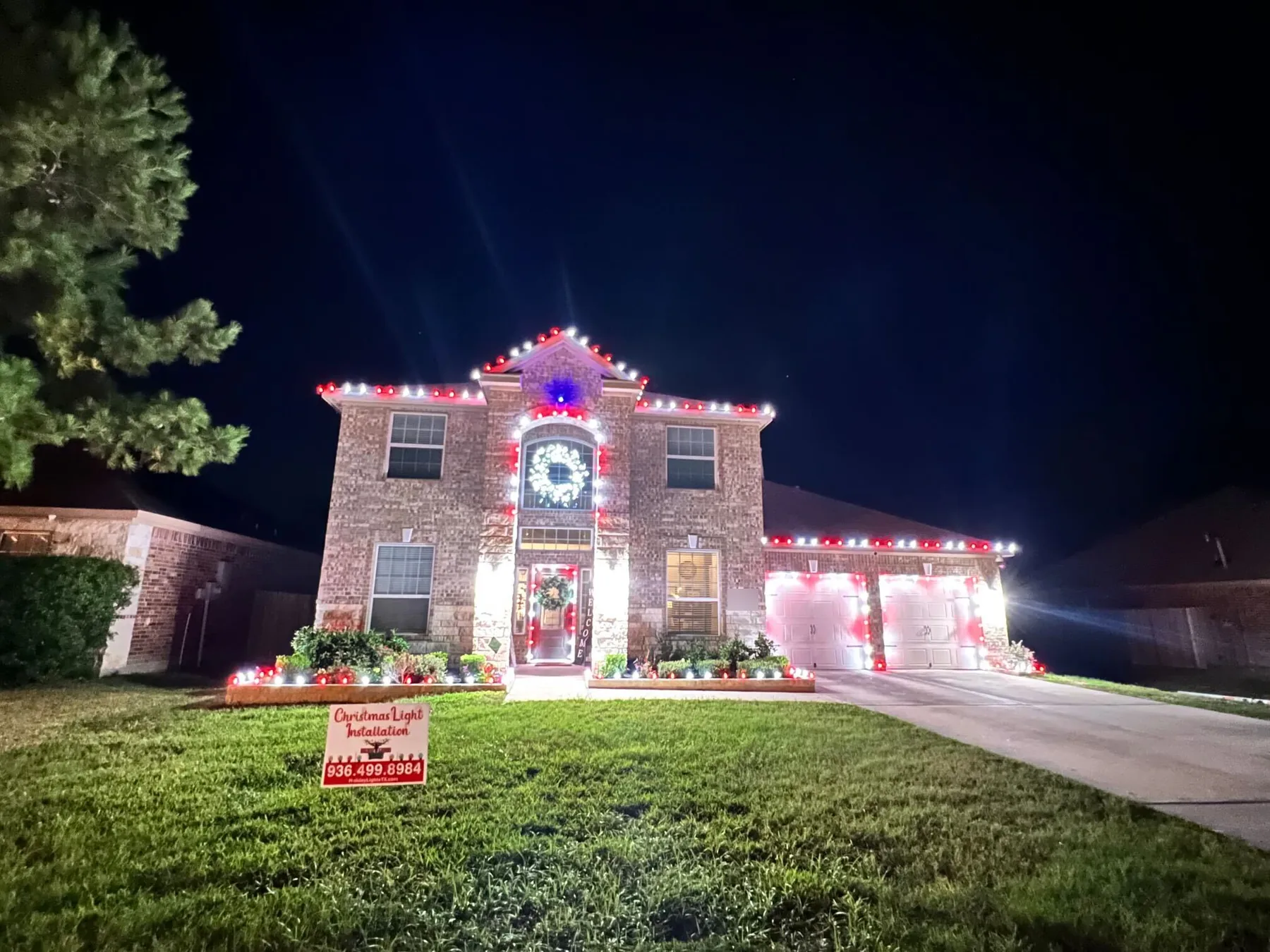
Red and white has a crisper, more graphic feel, like candy cane stripes. It looks sharp on dark brick or on a house with strong lines, and it is a good choice if you want something festive without looking busy. Either scheme looks best when one color leads and the other supports.
Cool white and blue
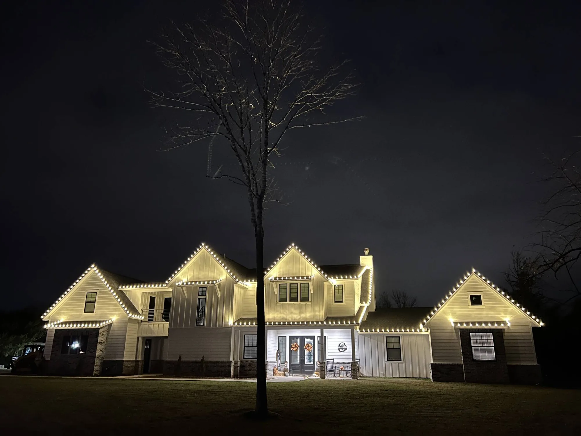
Cool white gives a modern, icy look that suits contemporary homes, painted white exteriors and houses with dark façades. Blue and white together evoke winter and Hanukkah, and are a good choice if your family celebrates either. A pure white scheme with a touch of blue can look quietly beautiful.
Be careful with cool tones on warm materials. Blue-leaning white on red brick can make the brick look dull. When in doubt, test the color on a photo of your own house with the see your home in lights tool before you commit.
Accent colors: purple, amber and beyond
Some customers want something less traditional: purple and white, amber or a single bold color. These can look striking when done with intent, and our gallery includes a purple and white roofline on a stone two-story home as an example. They suit a family that wants a signature look or one that is lighting for a team, a school or an occasion.
The rule is the same: choose one dominant color, keep the supporting tones simple, and make sure the choice suits the house. A bold scheme on a plain exterior works better than on a busy one.
Rules of thumb for any scheme
A few principles hold across every color choice. They are not laws, but they will keep you out of trouble.
If a scheme follows these, it will almost always look cohesive. If you want to break a rule, do it deliberately.
- Limit the palette to two colors, plus white
- Let one color lead and the other support
- Repeat each color in at least two places so it looks planned
- Match the white across the whole display
- Keep ground lighting simpler than the roofline
- Check HOA rules on color before you decide
How to decide and how to change your mind
If you cannot decide, browse the gallery and note the three homes you like most. They will usually share a color logic, and that tells you what you are drawn to. Then send us a photo of your house and we will recommend a scheme and explain why.
Because your set is stored and reinstalled each year, you can change the scheme later. A new color is quoted as a change, with new pieces cut to match the lines already in your set. See the annual reinstall for how that works.
Examples from real Texas homes
A brick Tudor-style home with three steep gables looks wonderful with red and green on the gables and a row of larger bulbs along the front beds, because the colors echo the brick and the steep roof gives the lights room. A two-story home with a long driveway looks cheerful in multicolor, with the driveway edge repeating the roofline color to lead the eye in.
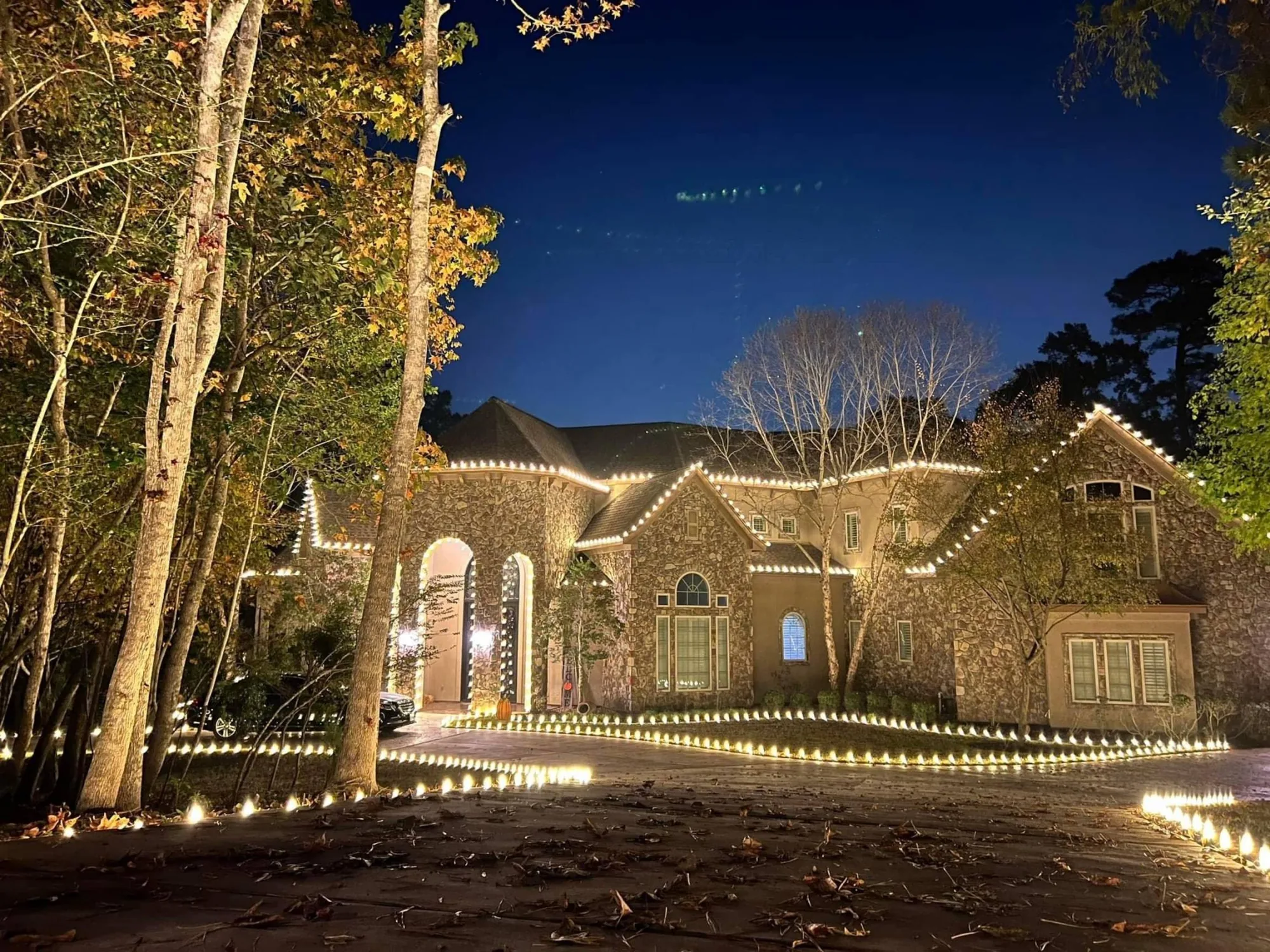
A stone two-story takes a purple and white scheme in a way that feels bold but still elegant, since the stone gives the color a neutral anchor. A brick estate in cool white looks crisp and expensive, with the lines doing the work. You can browse each of these in the gallery and see how the color relates to the materials.
Matching color to the occasion
Some households use more than one scheme through the season, for example white through the whole of December and a color change for a particular occasion. If you want that flexibility, ask about it when you request a quote. Not every design needs it, but it can be built in when it does.
If your family celebrates a holiday other than Christmas, tell us. A blue and white scheme for Hanukkah, or a design that carries through the winter holidays, is a perfectly good brief.
Common color mistakes
The most frequent mistake is using too many colors at once, which turns the display into visual noise. The second is mixing two whites without meaning to. The third is putting a strong color on something that does not need it, such as lighting every tree in a different color. Restraint is almost always the better choice.
If you worry that your scheme might be too much, show it to a friend with an honest eye, or try it with the see your home in lights tool before you commit.
Where to go from here
Once you have a direction, the best next step is to see it. Try the lights preview with a photo of your own home, browse similar houses in the gallery and then request a quote. We will confirm the scheme, explain why it works on your exterior and quote the exact footage. If you change your mind, the scheme can be adjusted before anything is cut.
Questions people ask
Warm white is the most reliable choice for brick. Red and white or red and green also harmonize with red brick when used with restraint.
Yes, if it is deliberate. A common approach is a multicolor roofline with white on the trees, so the color has a clear place and the rest stays calm.
Yes. Your set is stored and reinstalled each year, and a change of color is quoted as an update, with new pieces cut to match.
By the Holiday Lights Texas team, a family owned holiday lighting company based in Conroe, Texas. Published October 19, 2026, updated October 19, 2026. Every figure and policy referenced here is one the company publishes and honours on real properties. Where the company has not published a policy, this guide says so rather than guessing.
More in DesignAll resources