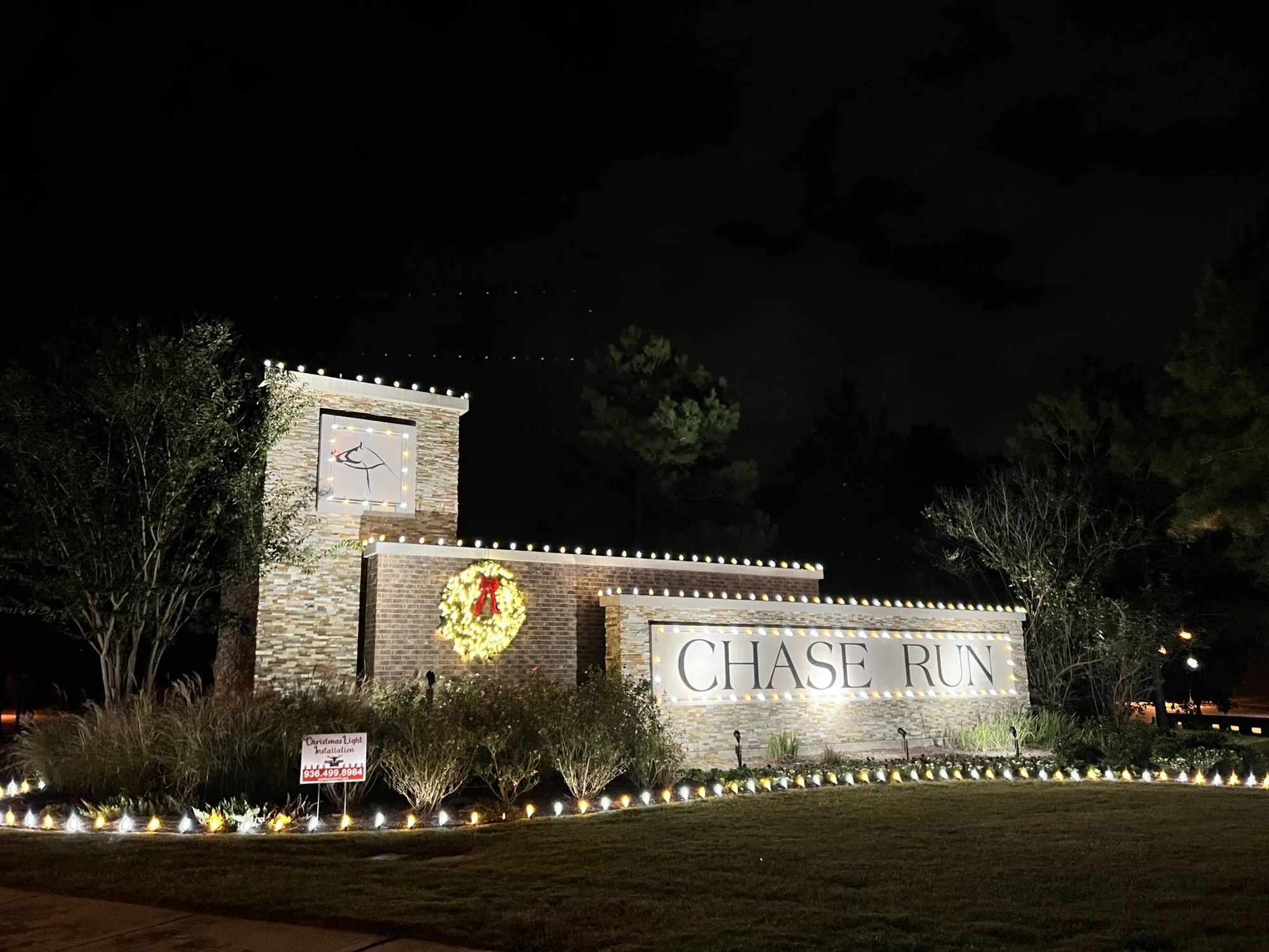
Designed for the sightline, not the close-up
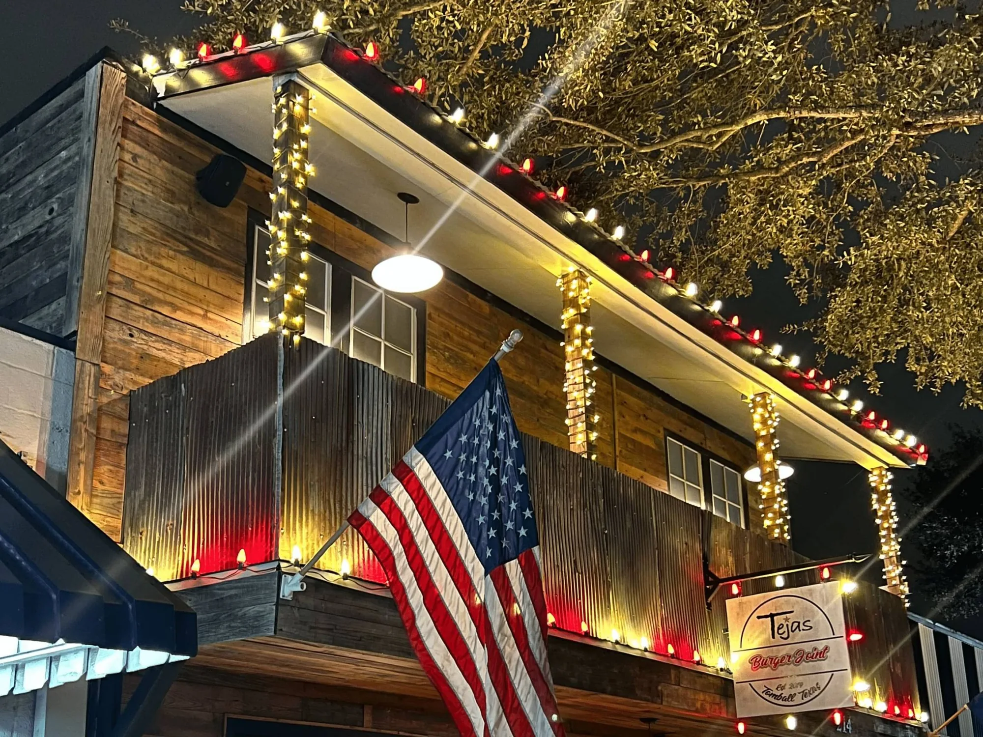
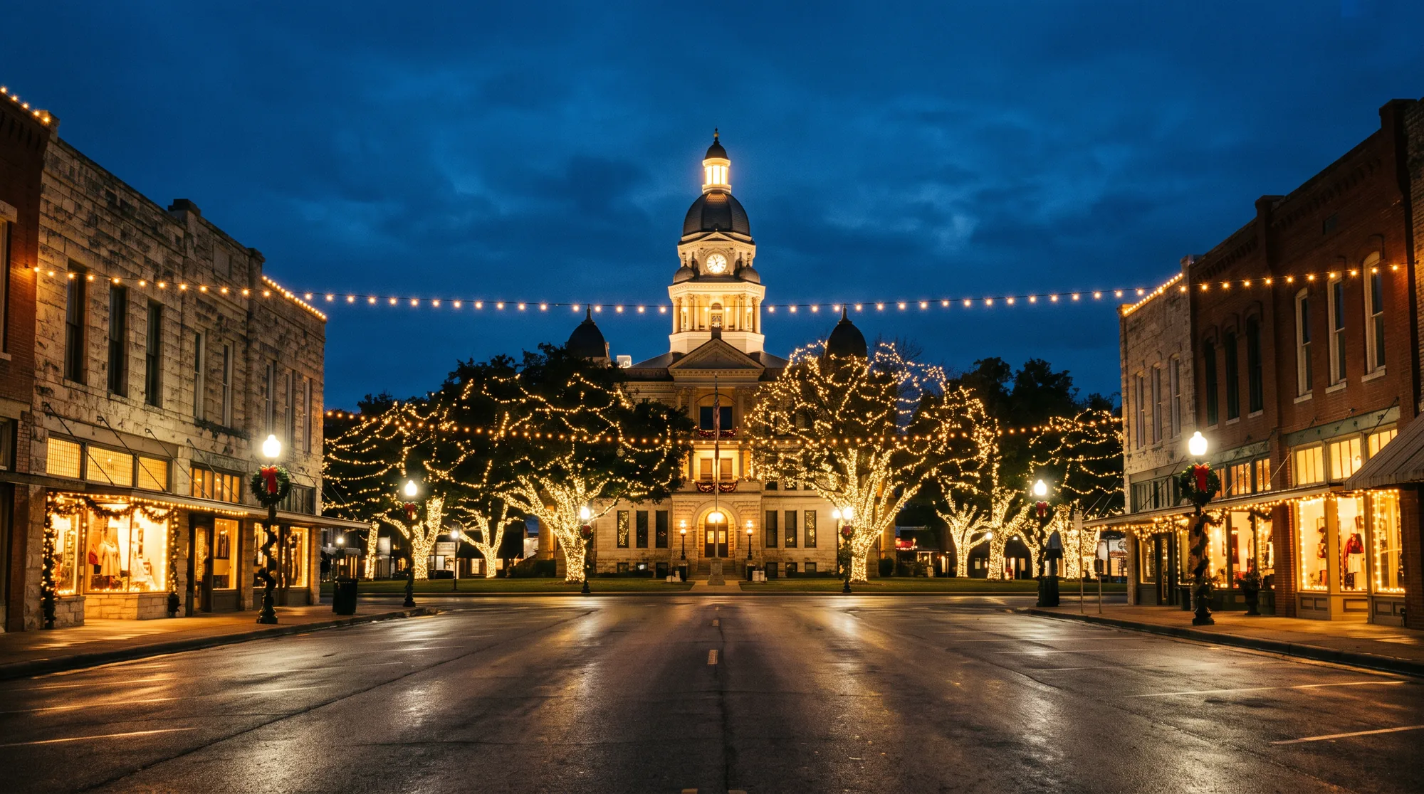
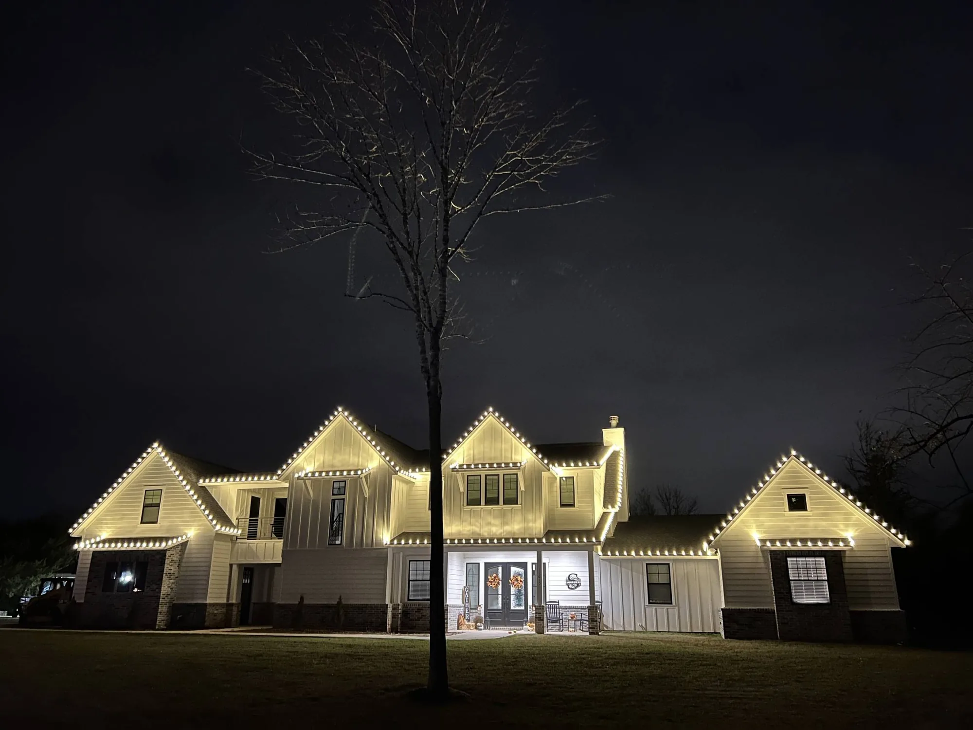
Most community lighting fails because it was designed to be looked at while standing still. Your residents never stand still. We design the entrance to be read at speed: high-contrast separation between the sign face and the wall behind it, consistent spacing along the approach beds, and enough light on the monument that the lettering resolves from the road.
- Sign faces lit so lettering resolves at distance
- Masonry lit to keep stone texture visible
- Bed lighting spaced evenly along the approach
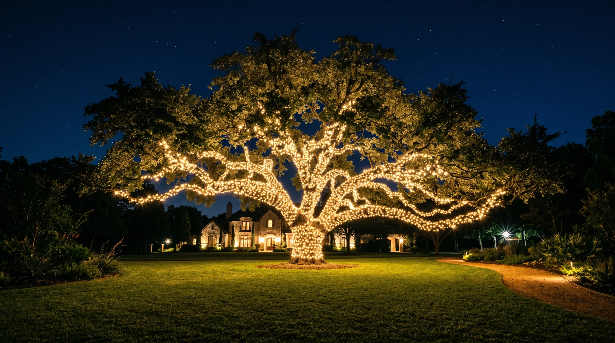
- Boulevard trees wrapped at a consistent rhythm