White is not one single look
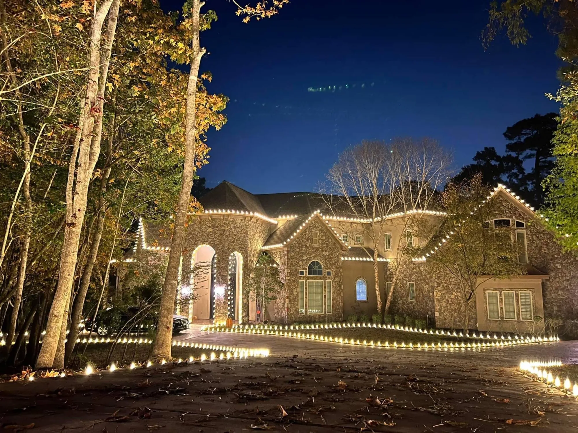
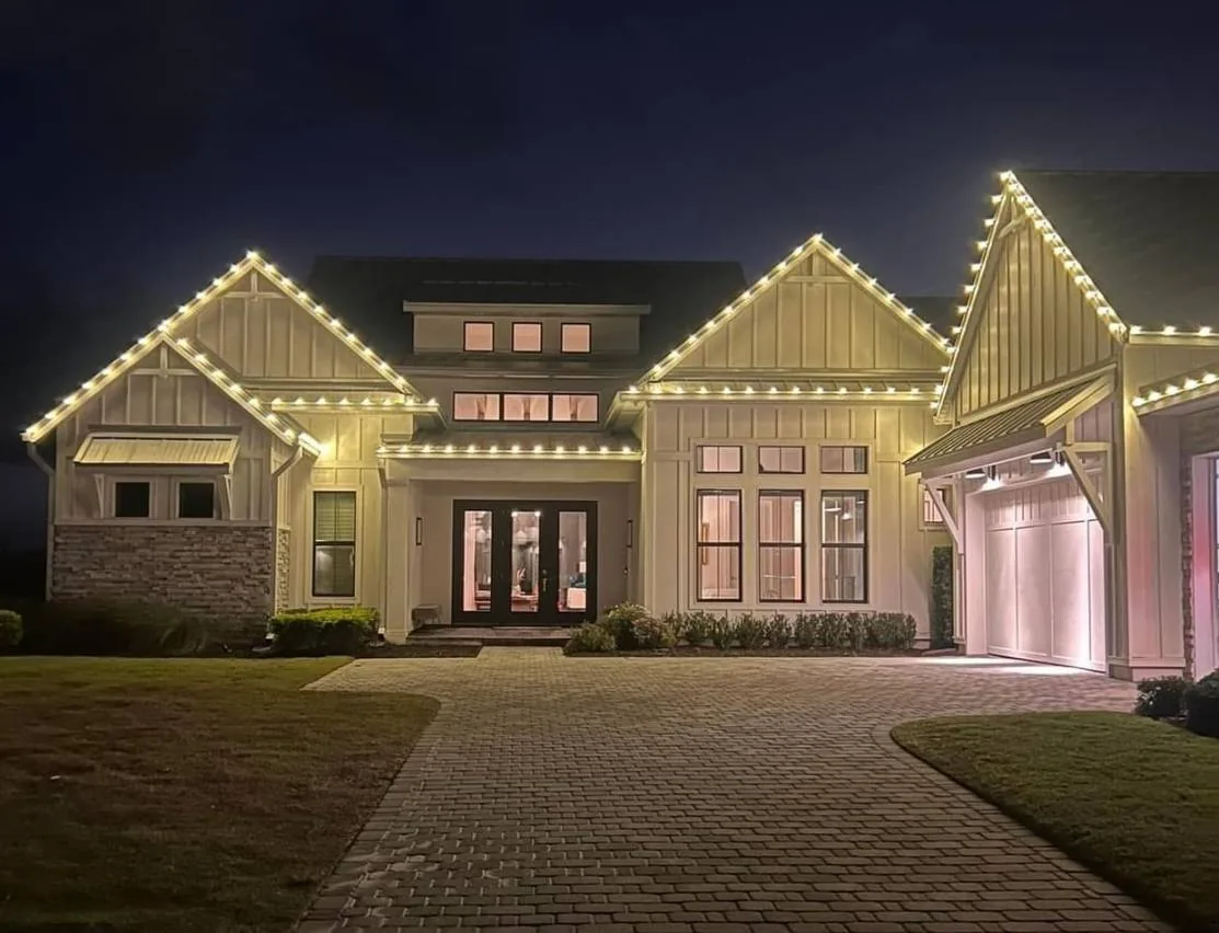
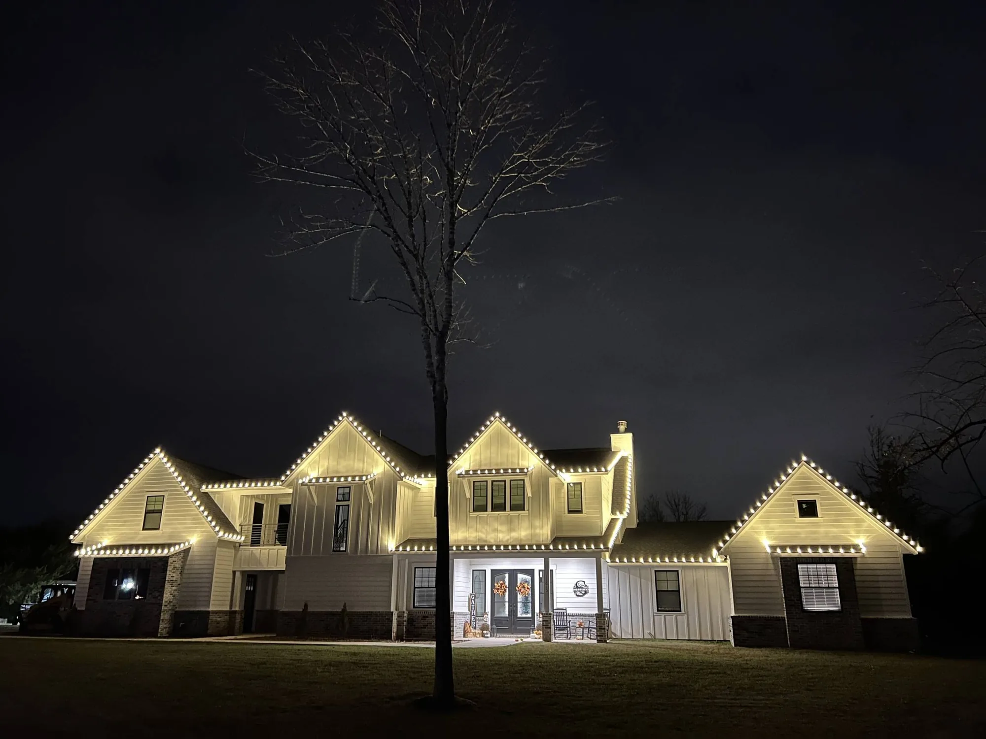
White holiday lights fall along a range from soft and golden to crisp and cool. The difference may seem small in daylight, but at night it changes how the roofline, stonework, paint, and landscaping read from the street.
Warm white has a softer, candle-like cast. Bright white looks cleaner and more neutral, with a stronger contrast against the dark sky and many exterior materials.
- Warm white: relaxed, golden, and traditional
- Bright white: clean, crisp, and higher contrast
- Neither choice is automatically better; the house and the desired mood decide it
Choose warm white for a classic, welcoming look
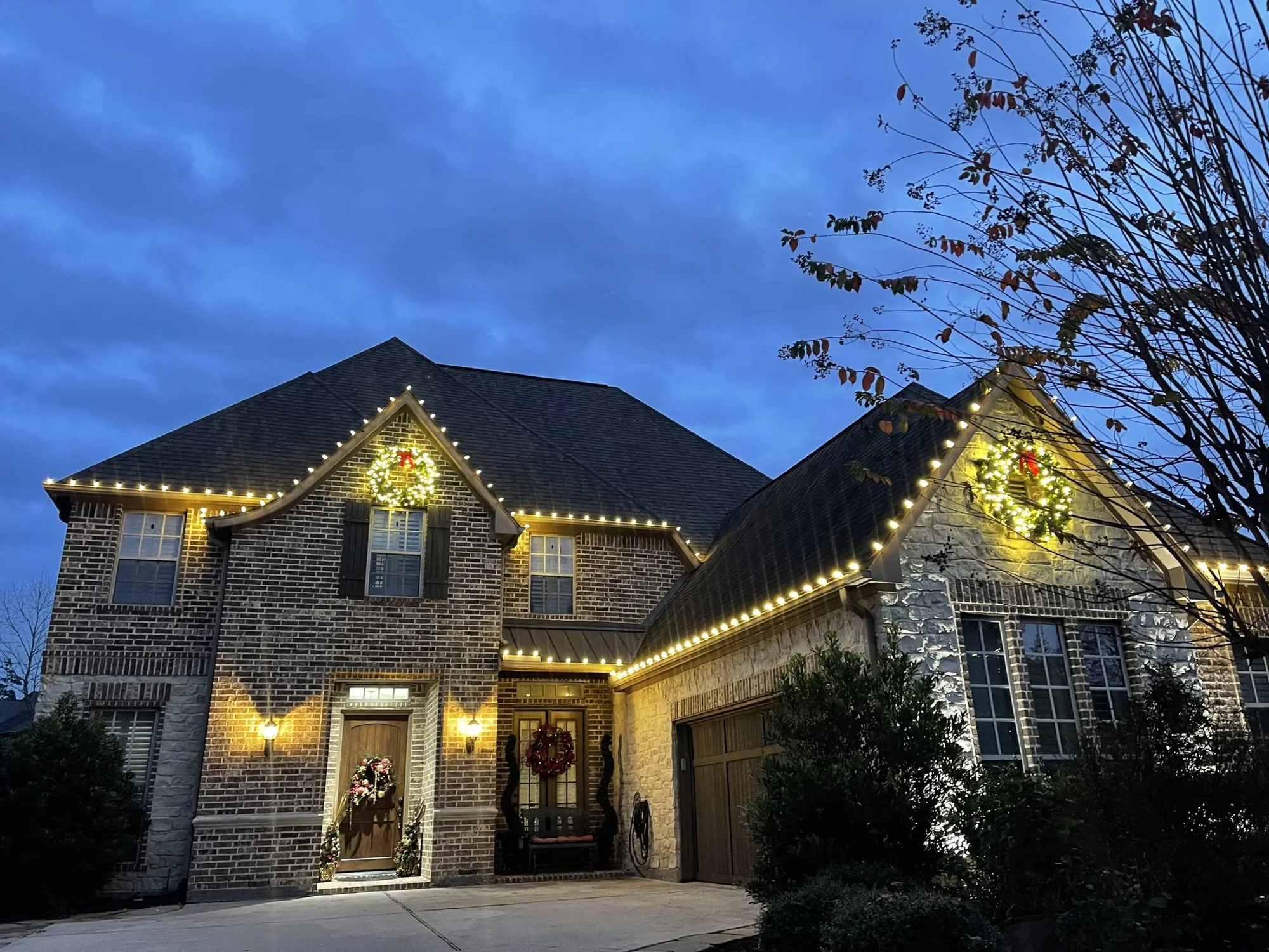
Warm white is a steady choice for homes with brick, natural stone, cream paint, wood details, or traditional architecture. It gives rooflines definition without making the light itself feel like the main event.
This tone also works well when the property has existing exterior lighting that leans warm. Matching that general cast keeps the front elevation from looking divided after dark.
- Brick homes with dark roofs and warm porch fixtures
- Farmhouse, ranch, traditional, and stone-front architecture
- Displays with evergreen wreaths, garland, red accents, or natural greenery
Use bright white when you want sharper definition
Bright white gives gables, dormers, and straight roof runs a more graphic outline. It can be a strong fit for contemporary homes, light stucco, dark trim, and properties where the architecture has simple, confident lines.
It also stands out well at a distance, which can matter on a larger lot or a prominent corner. The tradeoff is that it can look more formal and less soft than warm white beside amber porch lamps or rustic materials.
Look at the whole front elevation, not just the roof
The roofline usually leads the design, but the choice should work with the rest of the property. A bright line on the eaves may need a clean, restrained treatment on shrubs and driveway edges, while warm white can carry through trees and beds more quietly.
Take stock of what is already visible at night: porch sconces, path lights, a lit entry, windows, and dark landscaping. A thoughtful plan uses the existing view rather than fighting it.
- Roof color and material
- Brick, stone, siding, stucco, and trim color
- Existing exterior fixtures and their light color
- Mature trees, hedges, and the distance from street to house
Keep color combinations disciplined
A warm white display can take a red accent beautifully because both colors feel familiar together. Bright white can also pair with color, but it generally looks best when the color has one clear job, such as a wreath, entry, or a small run along the landscape.
Mixing several whites or adding color in every area can make a polished property look busy. One main light color and a limited accent create a design people can read in one glance.
See the choice in the context of your home
Screens and product photos are useful references, but they do not show how a particular roof, facade, and front yard will reflect light. A professional design conversation should begin with the property, your preferred mood, and the areas that deserve attention.
Holiday Lights Texas uses professional-grade, weather-rated LED lighting custom cut to the property. The system is designed around the home instead of asking the home to fit a retail strand length, so the finished white-light choice has a clean line to work with.
If you are undecided, describe the feeling you want more than the technical name of the color. Words such as classic, crisp, warm, formal, quiet, or festive give the design conversation a useful starting point and make it easier to compare options against the materials on your home.
Also consider the view on an ordinary weeknight, not only at a holiday party. The right color should look balanced when the driveway is empty, the porch lights are on, and the house is seen from the usual approach home. It should also work with the color of any wreath, garland, or landscape accents you choose, so the lighting reads as one complete design rather than a roofline added at the end for the season.
What the labels actually mean
Lighting color is described by its color temperature, measured in kelvins. Lower numbers look warmer and more golden, like candlelight or an incandescent bulb. Higher numbers look cooler and bluer, like daylight. Manufacturers use the words warm white, soft white, cool white and bright white loosely, and the exact shade varies from one brand to another.
That inconsistency is the main reason to look at the light rather than trust the label. Two products both called warm white can look noticeably different on a house. If a color matters to you, ask to see it, or compare photographs of real installations in the gallery.
Matching white to materials
Warm white tends to flatter natural and earthy materials. Red and tan brick, limestone, wood siding and cedar shake all look richer under a golden light. Cooler, crisper white tends to suit modern surfaces: painted trim, gray or white stucco, metal roofs and glass.
Think about the roof as well. Dark shingles absorb light and give warm white a deep, glowing look. Light-colored roofs reflect more, so a cooler white can appear stronger. None of this is a rule, but it is a good starting point when you are unsure.
Mixing warm and cool on one house
A common mistake is mixing two whites by accident, for example a warm roofline with cool-white trees. The difference looks unplanned. If you want both, make the contrast deliberate: a single color temperature for architectural lines and another for a clear accent such as a tree or a wreath.
When in doubt, choose one white for the whole display. Consistency does more for a polished look than variety does.
Where white sits in a color scheme
White is the most common choice because it works with every exterior and every neighbor. It is also the base for most color schemes, with red, green or blue added as accents. Our color scheme guide explains how to combine them.
If you are still deciding, request a quote and tell us about your home. We will recommend a white and show you examples that suit your materials.
A quick decision guide
If you want a single sentence of advice, it is this: choose warm white for brick, stone and wood, and choose crisp white for modern, painted or dark exteriors. Then choose one white and use it everywhere. That decision alone will make your display look more deliberate than most.
If you are still unsure, ask us to show you examples on homes like yours. The gallery is a good place to start, and the see your lights on your house tool lets you try colors on a photo of your own home before you decide.
We will also tell you honestly if we think a color will not suit your house. A good designer's job is to say no sometimes.
Does color temperature affect brightness?
Color temperature and brightness are separate things. A warm white and a cool white bulb can be equally bright, but the cooler one often feels brighter to the eye because blue-leaning light looks sharper at night. That impression is part of why some people like crisp white and others find it harsh.
Brightness is better judged by comparing the display with the neighbors and the street. A warm, even glow that reads clearly from the road is usually more pleasing than a very bright one.
Seeing is believing
Color is hard to judge from a description, so look at real examples before you decide. The gallery shows warm white and cool white on brick, stone and stucco, so you can compare how each material responds. If you want to see your own home, upload a photo to the lights preview tool and try both. A few minutes of looking will teach you more than any paragraph of advice.
By the Holiday Lights Texas team, a family owned holiday lighting company based in Conroe, Texas. Published September 15, 2026, updated October 1, 2026. Every figure and policy referenced here is one the company publishes and honours on real properties. Where the company has not published a policy, this guide says so rather than guessing.
More in DesignAll resources